OYSTER GIN
Brand Creation
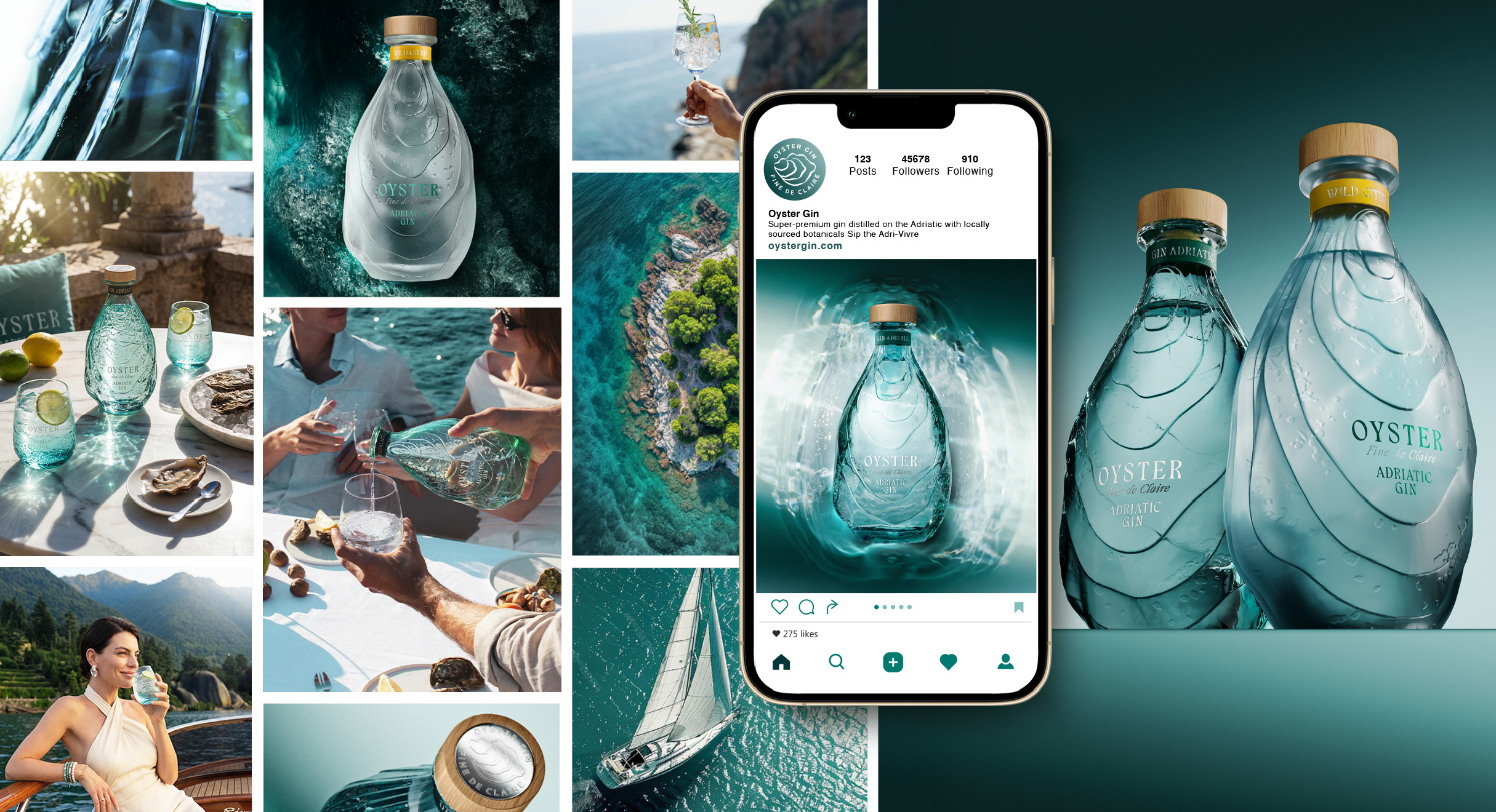
Crafted in Montenegro, where rugged mountains meet the Adriatic, Oyster Gin draws from a terroir defined by purity, understated elegance, and hedonistic enjoyment. The agency’s objective was to translate this Adriatic art de vivre into an identity that stands apart in the premium spirits segment while feeling iconic and true to place.
Read the full story
OYSTER GIN
Brand Creation
From Cartier’s panther to Hermès’ horse to Fabergé’s eggs, luxury brands have always turned to nature for inspiration. Its power comes from the universal dualities it embodies, and from the way it awakens our deepest emotions: fragile yet fierce, timeless yet ever-changing, raw yet refined. These tensions mirror luxury’s aim to create objects that resonate both emotionally and symbolically.
In a spirits industry that prizes eco-consciousness and authenticity, nature, often used as an ornamental detail in design, can take center stage and become the foundation of a lifestyle and deeper meaning, as we’ve embodied with Oyster Gin.
Appartement 103 built the brand from the ground up, including structural bottle design, visual identity, and a global brand world. Designing an “oyster bottle” in its purest form risked feeling gimmicky, so the challenge was to channel nature’s forms with precision and sophistication, while reinterpreting them. The ambition was to craft a sculptural, iconic bottle, an object of desire as memorable as the oyster’s singular shape.
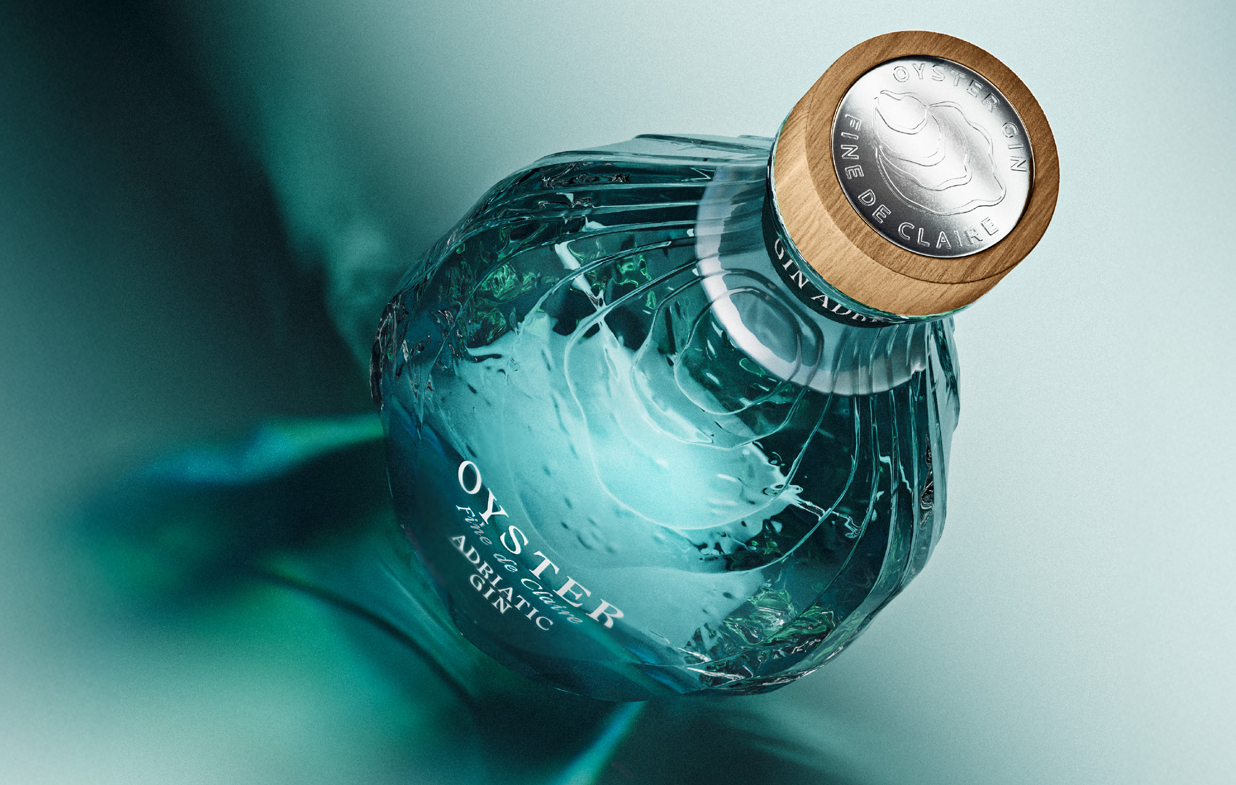
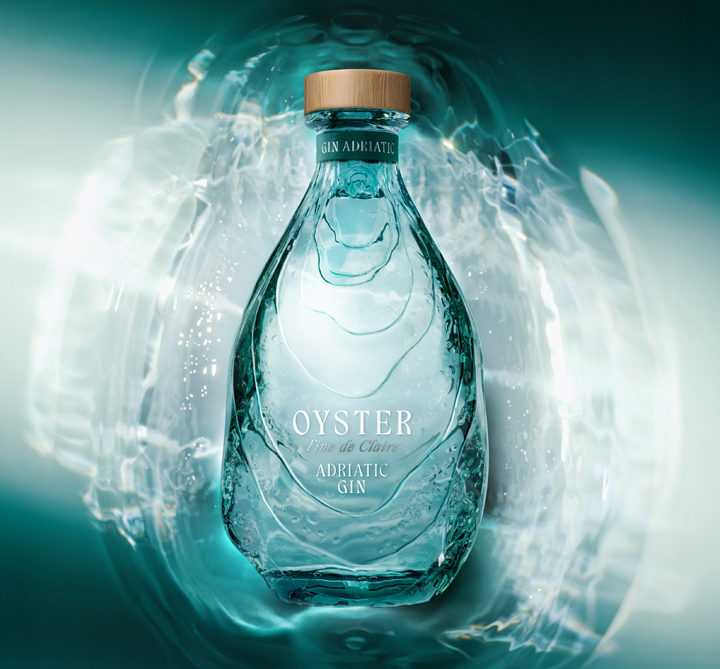
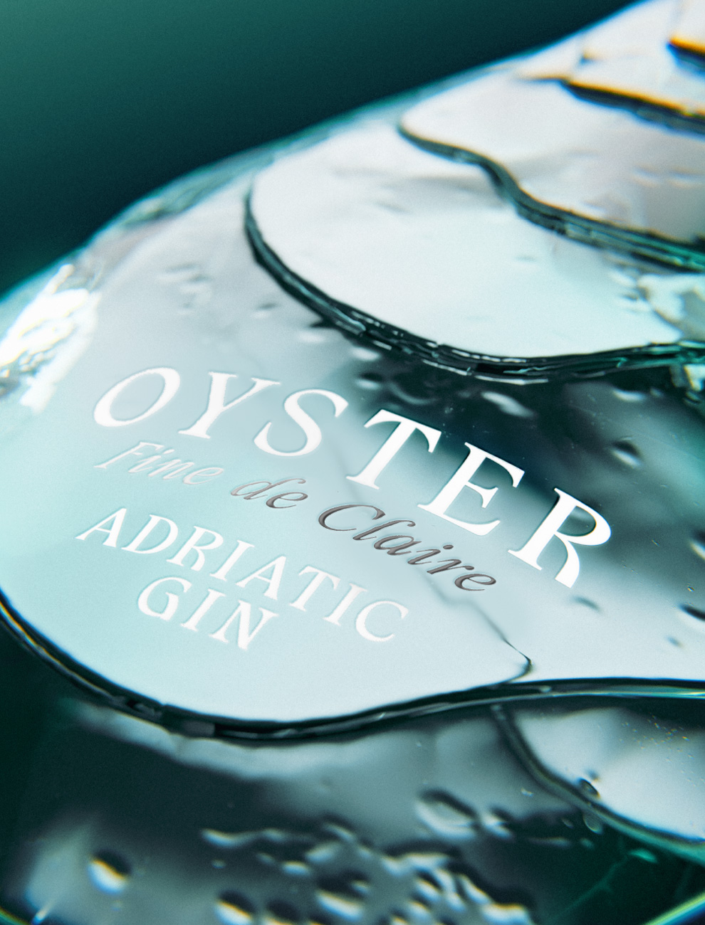
Rather than decorate with nature, we designed from it. The bottle’s sculptural form draws on the oyster shell, an iconic presence with natural irregularities that protect the refined drink within. An embossed, organic silhouette suggests layered strata, while transparent glass with a subtle green tint elevates the storytelling, evoking a gentle “water echo,” like a wave meeting the shore. The result is tactile, elegant, and instantly recognizable.
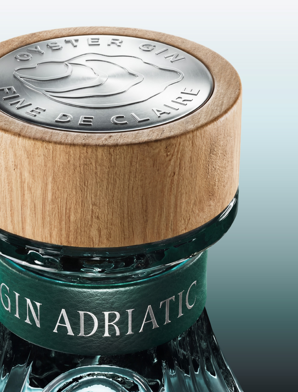
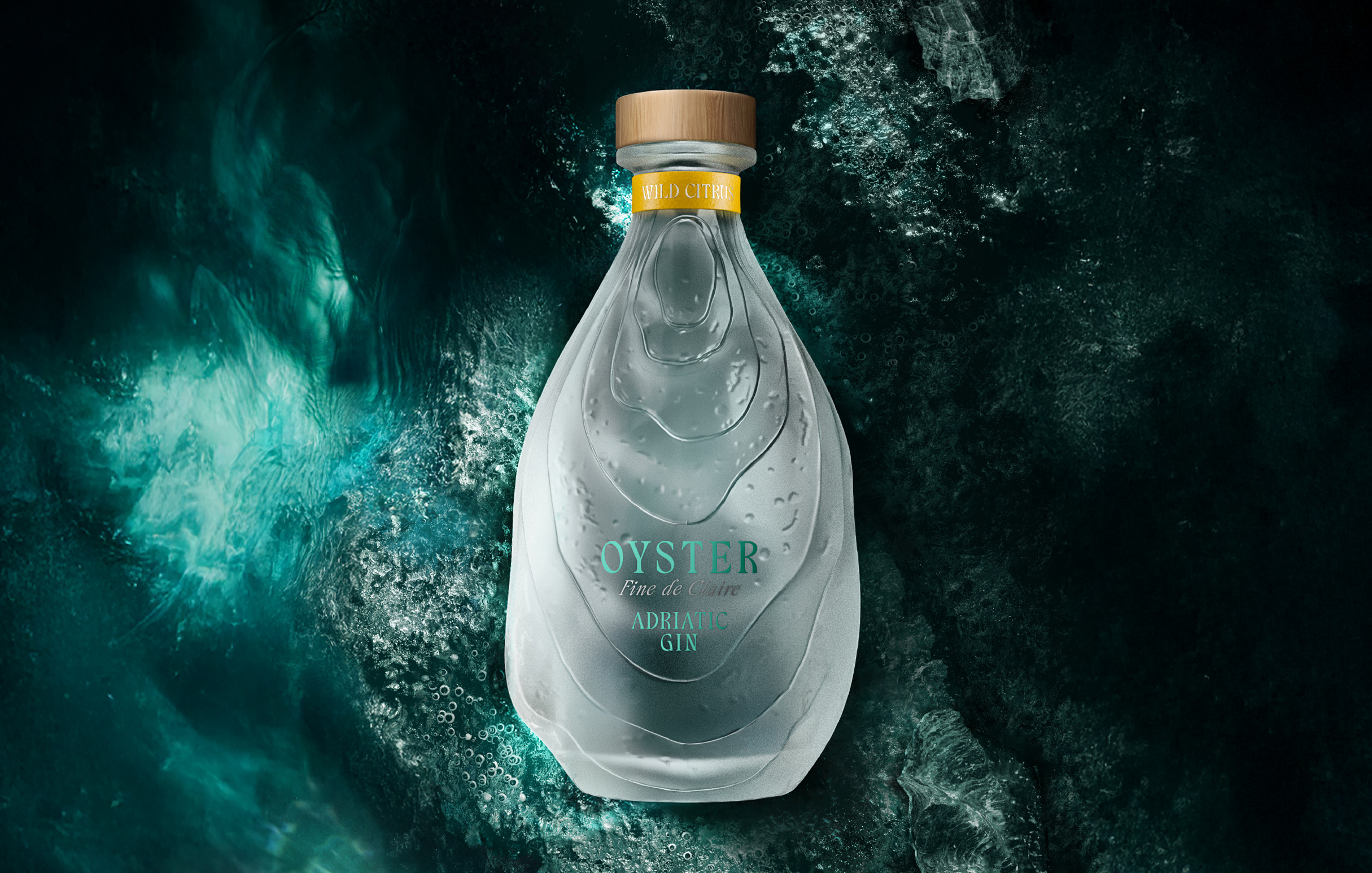
Glass finishing defines each expression. The Adriatic Gin SKU features subtle green glass that evokes clear waters, paired with a deep-green leather neck ring. Wild Citrus adopts a frosted glass finish for a more tactile experience. Both SKUs are completed with natural wooden closures and an embossed metal coin, grounding the design in craft and authenticity. Typography, branding, and iconography are quiet and elegant in their details, allowing the bottle’s iconic shape to lead.
As nature battles for survival in a technology-led world, spirits brands have a duty to honor its essence, acknowledging the value it brings to their craft.
Brand Creation
From Cartier’s panther to Hermès’ horse to Fabergé’s eggs, luxury brands have always turned to nature for inspiration. Its power comes from the universal dualities it embodies, and from the way it awakens our deepest emotions: fragile yet fierce, timeless yet ever-changing, raw yet refined. These tensions mirror luxury’s aim to create objects that resonate both emotionally and symbolically.
In a spirits industry that prizes eco-consciousness and authenticity, nature, often used as an ornamental detail in design, can take center stage and become the foundation of a lifestyle and deeper meaning, as we’ve embodied with Oyster Gin.
Appartement 103 built the brand from the ground up, including structural bottle design, visual identity, and a global brand world. Designing an “oyster bottle” in its purest form risked feeling gimmicky, so the challenge was to channel nature’s forms with precision and sophistication, while reinterpreting them. The ambition was to craft a sculptural, iconic bottle, an object of desire as memorable as the oyster’s singular shape.
Rather than decorate with nature, we designed from it. The bottle’s sculptural form draws on the oyster shell, an iconic presence with natural irregularities that protect the refined drink within. An embossed, organic silhouette suggests layered strata, while transparent glass with a subtle green tint elevates the storytelling, evoking a gentle “water echo,” like a wave meeting the shore. The result is tactile, elegant, and instantly recognizable.
Glass finishing defines each expression. The Adriatic Gin SKU features subtle green glass that evokes clear waters, paired with a deep-green leather neck ring. Wild Citrus adopts a frosted glass finish for a more tactile experience. Both SKUs are completed with natural wooden closures and an embossed metal coin, grounding the design in craft and authenticity. Typography, branding, and iconography are quiet and elegant in their details, allowing the bottle’s iconic shape to lead.
As nature battles for survival in a technology-led world, spirits brands have a duty to honor its essence, acknowledging the value it brings to their craft.
Brand Positioning
Packaging
Visual Identity
Close the full story
“Our collaboration with Appartement 103 has been both inspiring and seamless. Their talent for elevating branding while crafting a distinctive structural bottle shape has brought our vision to life in a way that feels truly iconic.”
Dmitri Nasalskiy, Marketing Director, Noblewood Group