RAZEL'S
New brand development
Backed by the growing trend of flavored rums and a gap spotted in the market for the lack of quality products offering sweet flavours, Razel's captures the unmistakable taste of famous American delicacies, combined with the elegance of the finest Caribbean rum to create a delicious presentation.
Read the full story
RAZEL'S RUM
New brand development
We were chosen by German distributor Perola Fine Spirits to create Razel's, a brand new rum that liquifies American flavours and desserts. Sweet idea, right?
Our team worked on Razel's visual brand identity and primary packaging design, including standard bottle embossings, labels graphic design, brand world and key visuals.
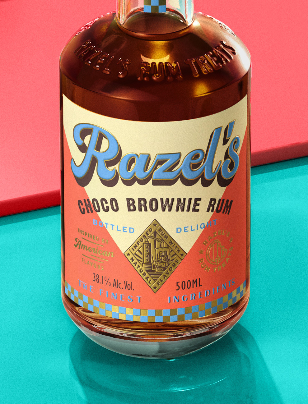
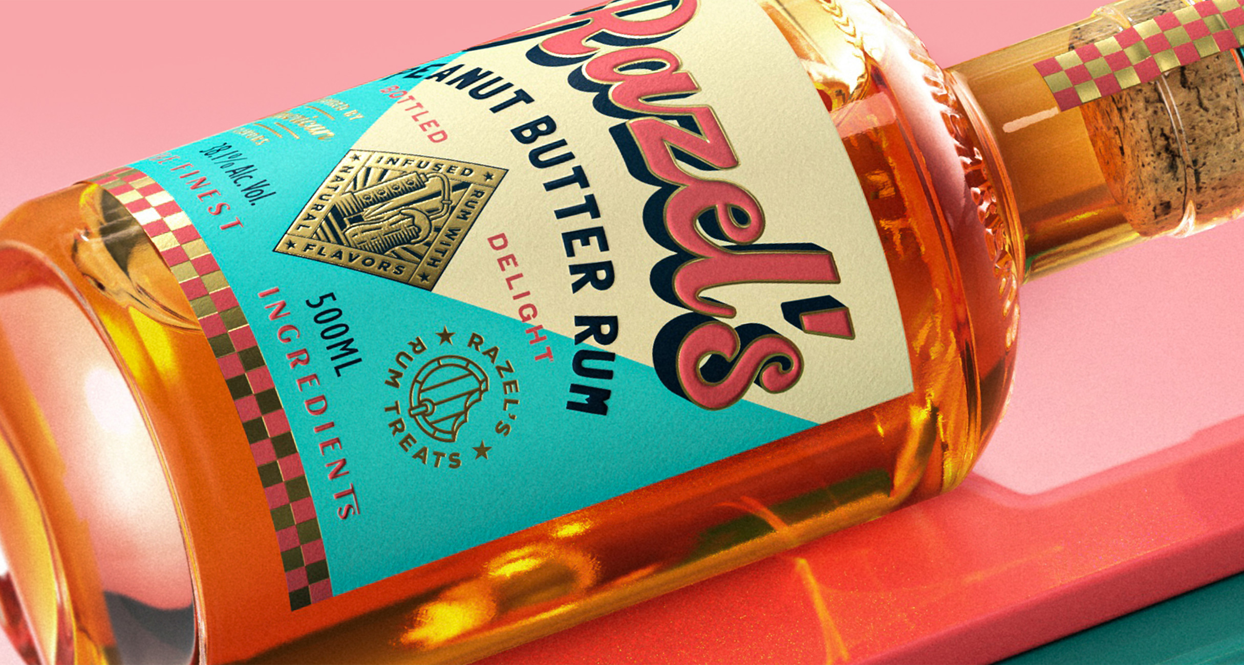
Backed by the growing trend of flavoured rums in the drinks industry and a gap spotted in the market for the lack of quality products offering sweet flavoured rums, the brand objective was clear: Capture the unmistakable taste of famous American delicacies, such as peanut butter and choco brownie, combined with the elegance of the finest Caribbean rum to create a delicious presentation, grabbing consumers' attention and desire.
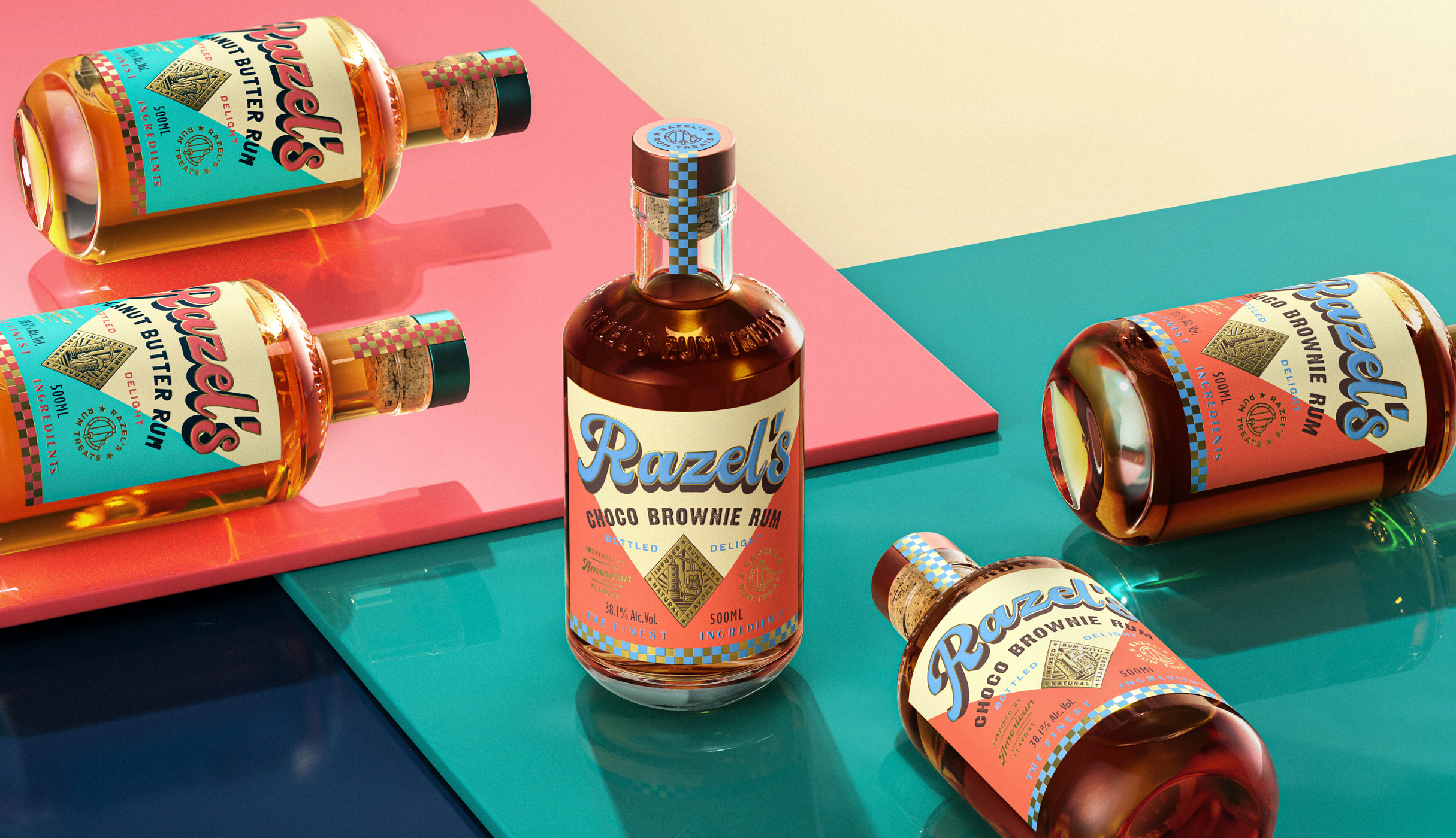
Promoting creativity and freedom, Razel's is a versatile drink that can be enjoyed purely as a dessert by itself, but also in crazy drinks or as an ingredient in desserts; your imagination is the limit.
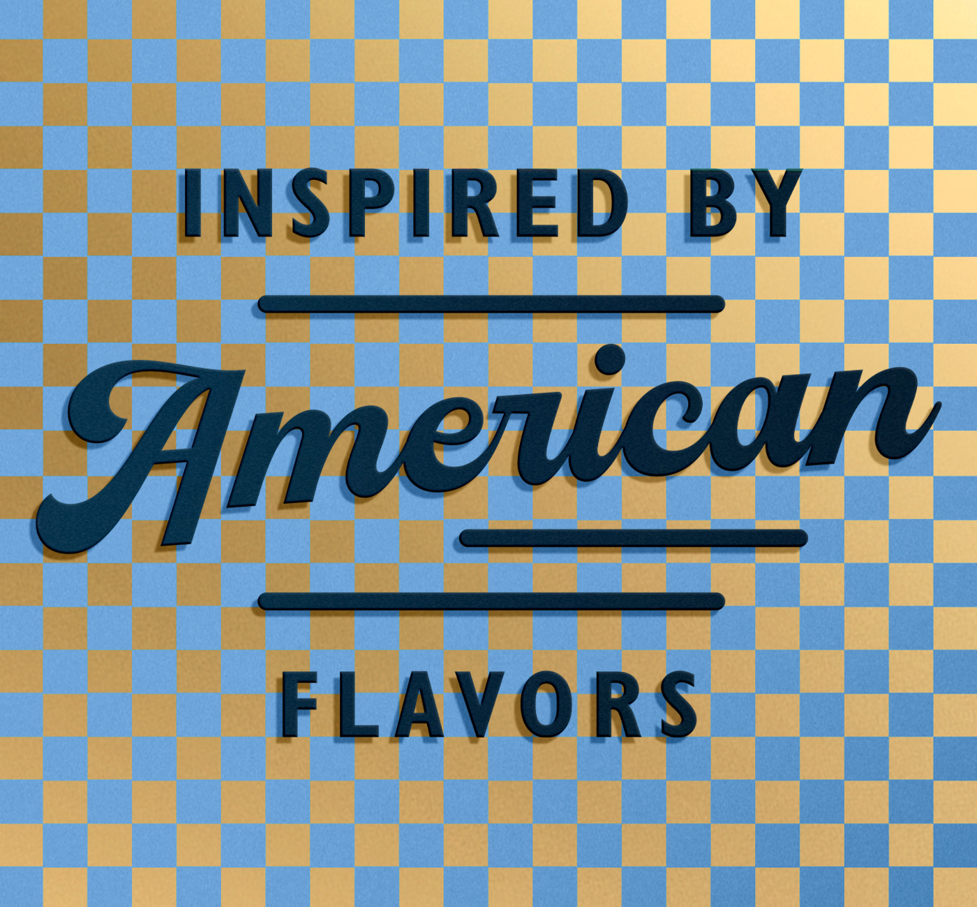
With the main direction defined, we took inspiration in the American diners on Route 66, where time has stopped since 1955.
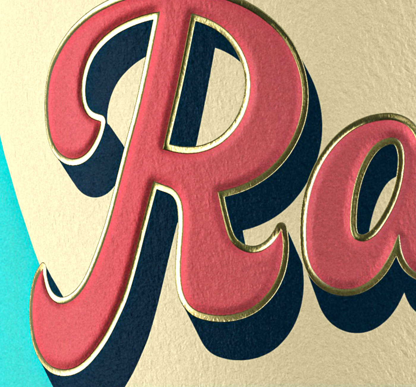
This idea was conveyed using vintage yet surprising colour combinations to create vibrancy while evoking an emotional connection with the 50's period.
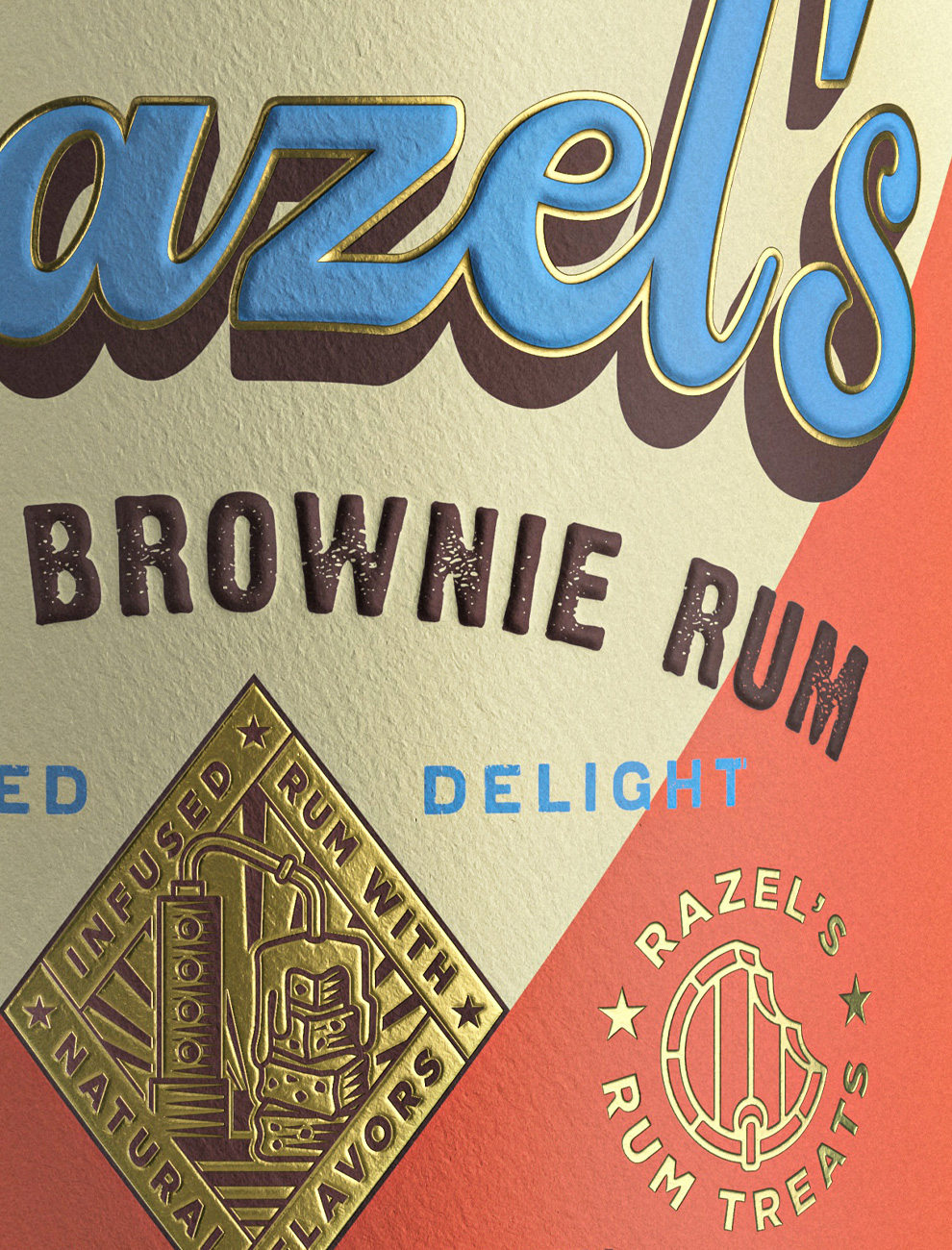
Beyond the colourful patterns, the agency played with typefaces variety and illustrations to portray this fun side of the brand while still conveying premiumness. In each variant, you can spot the illustration of the peanut butter and choco brownie being somewhat distilled, a fun detail that depicts the natural aromas infused during the production process.
Adding more playfulness and a sense of sweet taste into the pack, a secondary icon that we like to call 'the eaten barrel' was designed.
All the above elements were carefully implemented with premium finishings. The use of hot-foil finishing, bubbly varnish and embossings help convey the brand's inspiration with an elevated premium touch to the overall presentation.
New brand development
We were chosen by German distributor Perola Fine Spirits to create Razel's, a brand new rum that liquifies American flavours and desserts. Sweet idea, right?
Our team worked on Razel's visual brand identity and primary packaging design, including standard bottle embossings, labels graphic design, brand world and key visuals.
Backed by the growing trend of flavoured rums in the drinks industry and a gap spotted in the market for the lack of quality products offering sweet flavoured rums, the brand objective was clear: Capture the unmistakable taste of famous American delicacies, such as peanut butter and choco brownie, combined with the elegance of the finest Caribbean rum to create a delicious presentation, grabbing consumers' attention and desire.
Promoting creativity and freedom, Razel's is a versatile drink that can be enjoyed purely as a dessert by itself, but also in crazy drinks or as an ingredient in desserts; your imagination is the limit.
With the main direction defined, we took inspiration in the American diners on Route 66, where time has stopped since 1955.
This idea was conveyed using vintage yet surprising colour combinations to create vibrancy while evoking an emotional connection with the 50's period.
Beyond the colourful patterns, the agency played with typefaces variety and illustrations to portray this fun side of the brand while still conveying premiumness. In each variant, you can spot the illustration of the peanut butter and choco brownie being somewhat distilled, a fun detail that depicts the natural aromas infused during the production process.
Adding more playfulness and a sense of sweet taste into the pack, a secondary icon that we like to call 'the eaten barrel' was designed.
All the above elements were carefully implemented with premium finishings. The use of hot-foil finishing, bubbly varnish and embossings help convey the brand's inspiration with an elevated premium touch to the overall presentation.
Brand identity
Packagings
Brand world
Key visuals
Close the full story
“Appartement 103 delivered an amazing job in bringing our Razel’s brief to life and developing a visual brand identity which captures perfectly its spirit. The team added additional value by sharpening the brand’s core values and providing helpful directions. We are highly satisfied with the project outcome and cannot thank Appartement 103 enough for the great work and the pleasant, professional cooperation.”
Arno Schmid-Egger - Managing Director - Perola GmbH