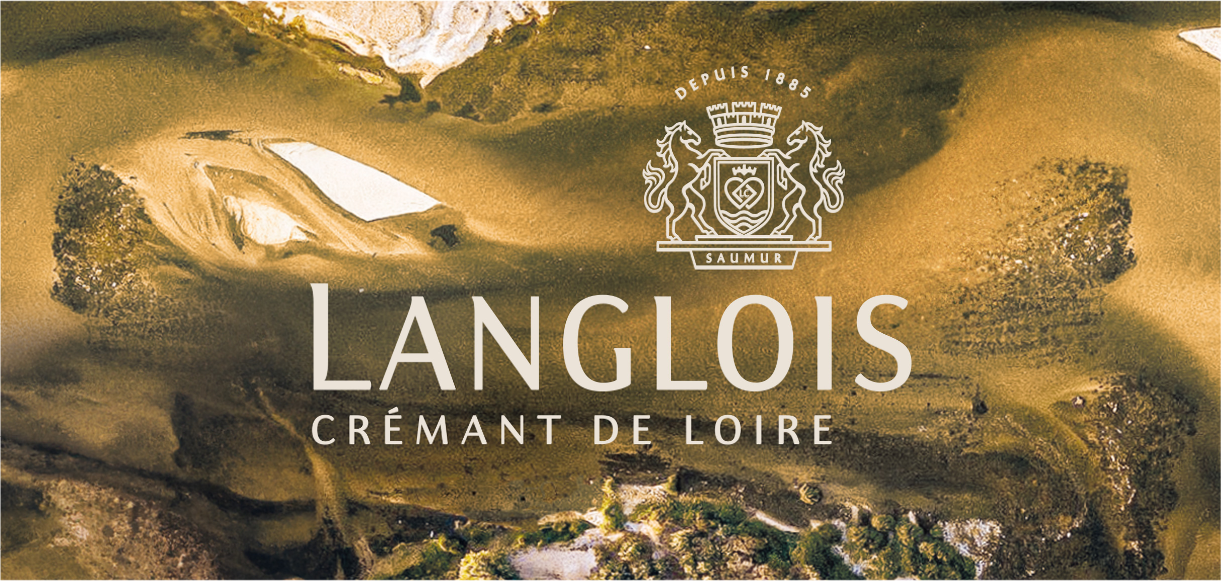
LANGLOIS
Brand Redesign
Maison Langlois, owned by the Bollinger group, has crafted exceptional Crémant de Loire since 1885. Mastering the art of Chenin Cépage, we took on the challenge of elevating the brand and the Crémant category beyond champagne comparisons. From brand strategy to visual identity, Langlois embraces the inspiration of the Loire river, blending tradition with modernity to create an authentic new experience.
Read the full story
LANGLOIS
Brand Redesign
Maison Langlois, owned by the Bollinger group, was established in 1885 on the banks of the Loire River, where it produces exceptional Crémant de Loire with a commitment to innovation and uncompromising quality. Although the Crémant category is often viewed as a low-quality substitute for champagne due to its lower price point, Langlois utilises the Chenin Cépage to add personality, premiumness and distinctiveness to its Crémant de Loire, challenging this perception.
The brand aims to shift consumer perception away from comparing Crémant to champagne, positioning Langlois as a unique and desirable choice that elevates the category.
We capitalised on Langlois' key differentiators in the world of bubbles to establish the brand as a pure player with its own path and vision.
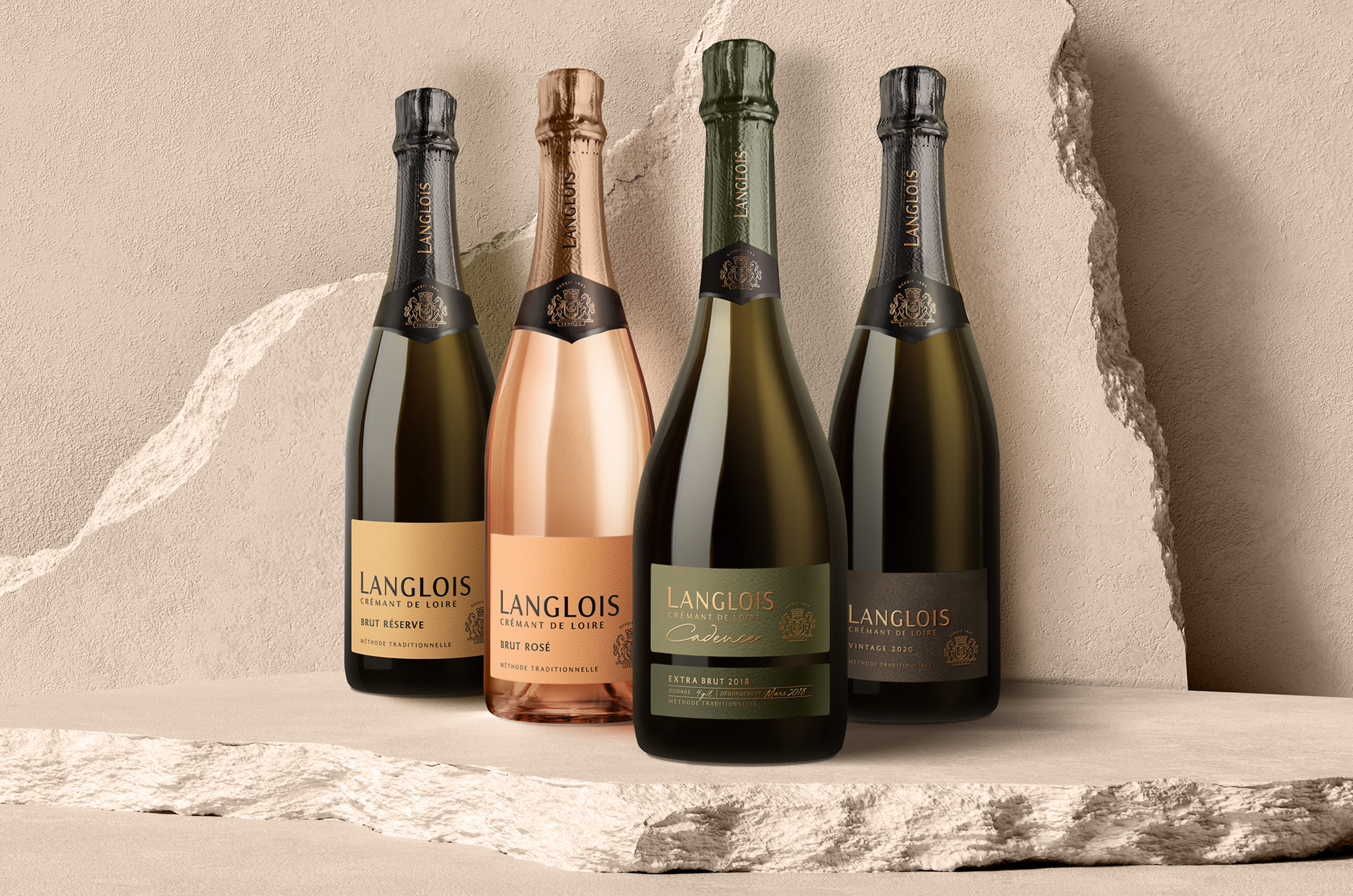
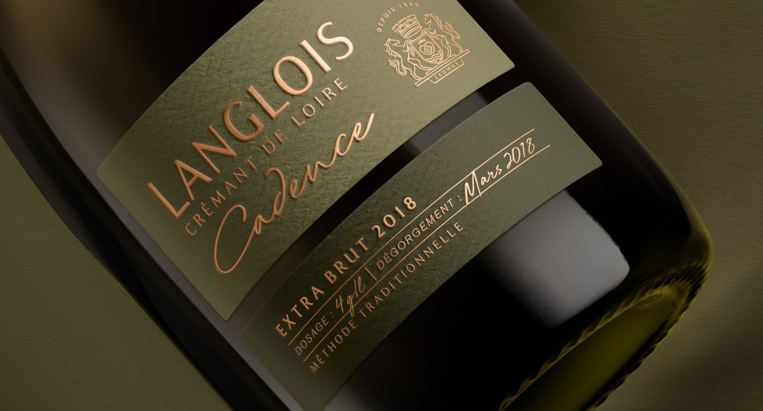
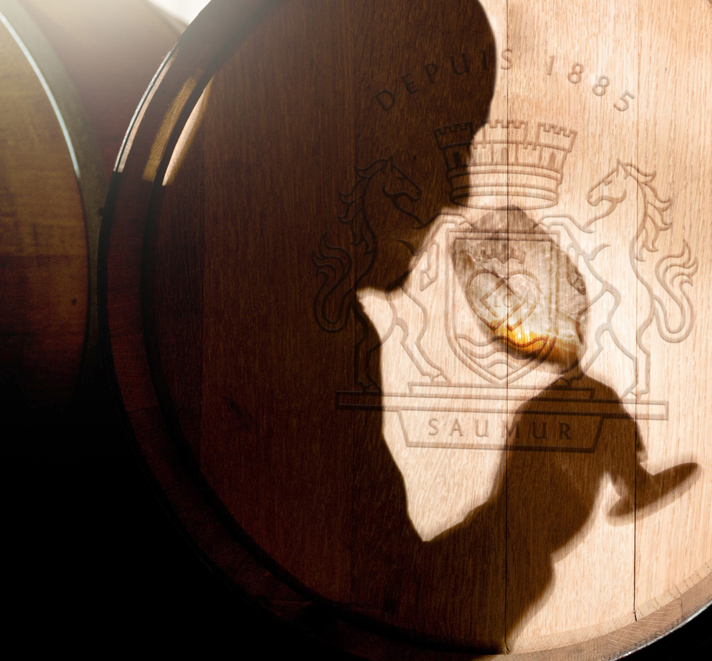
Langlois has always been able to harmoniously combine ancestral know-how with a precise and resolutely modern method. A unique mastery of the Chenin Cépage, in the service of an exceptional crémant.
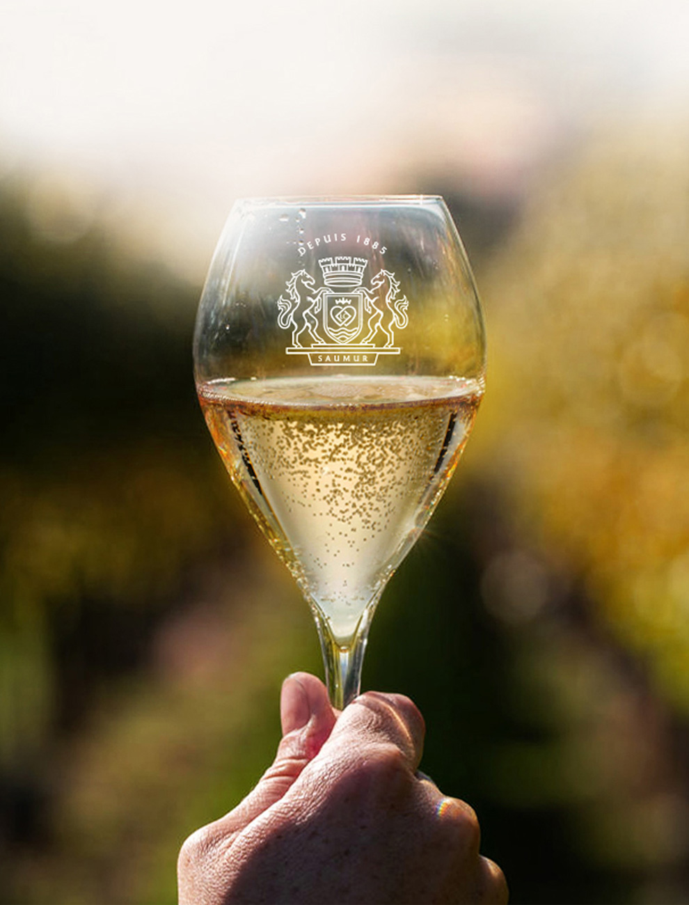
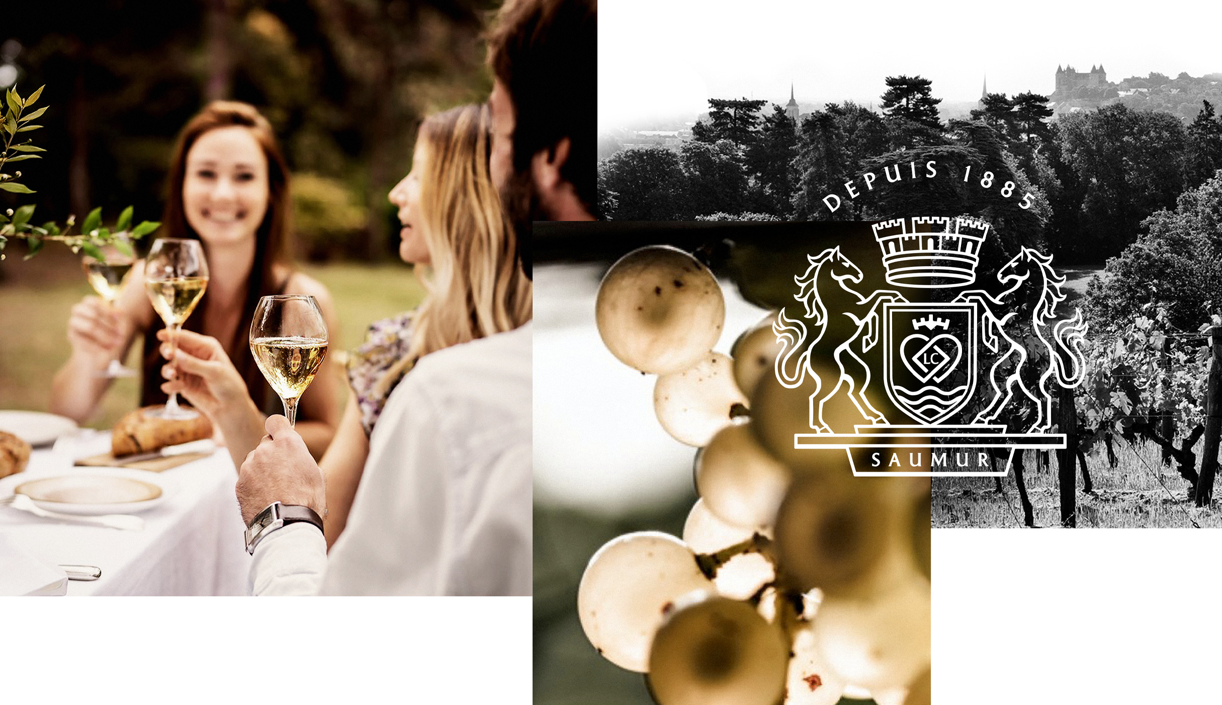
Beyond its knowledge, the Loire region, and its famous river, is an inexhaustible source of creation. Its grandiose vast landscapes and unique colours are continually redesigned with each caprice of the river. Langlois draws inspiration from this beautiful and contrasting nature to offer an authentic, sincere and characterful Crémant.
The brand strategy and visual identity capitalise on these unique selling points to connect with consumers emotionally and challenge the establishment within the category. A 360-degree approach ensures the brand's positioning is accurately expressed across all touchpoints, from the brand strategy to the global visual identity, resonating with consumers at every step.
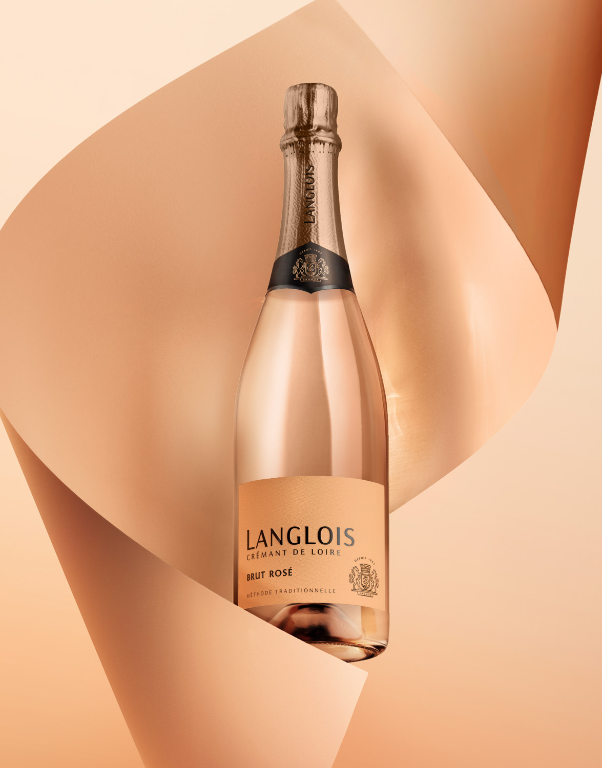
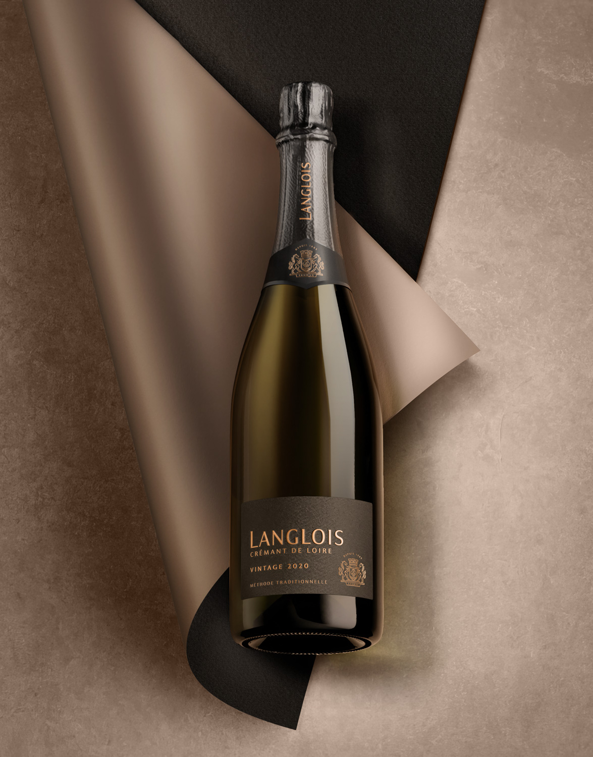
The bold branding choices reflect the Ligérien way of life with high spirits, simplicity, and light softness. The design prioritises simplicity, focusing on essentials while being spontaneous, less elitist, and technical. The natural and elegant aspects of the brand are allowed to express themselves through minimalistic touches and highly crafted details that enhance the product's quality look and feel.
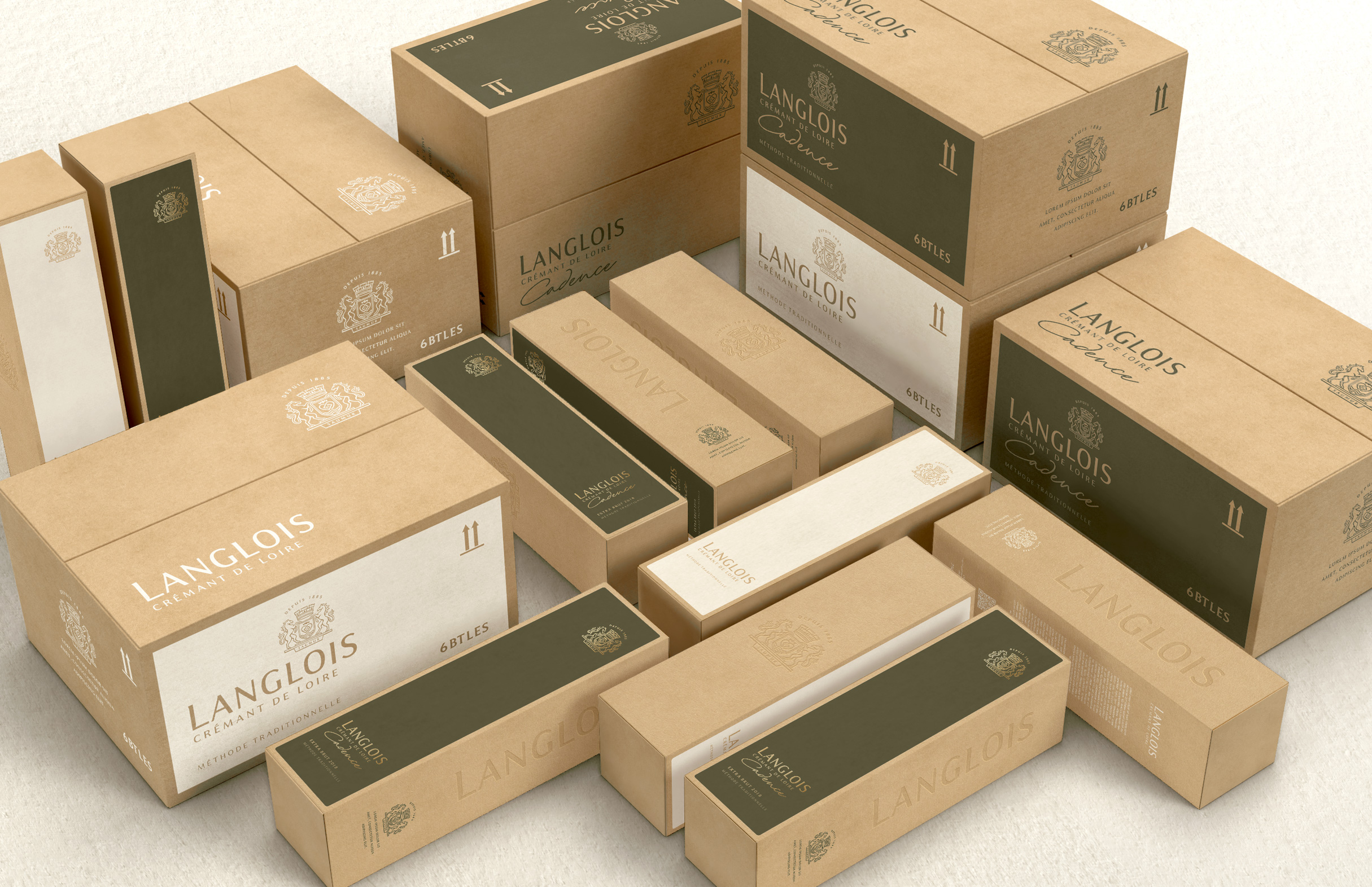
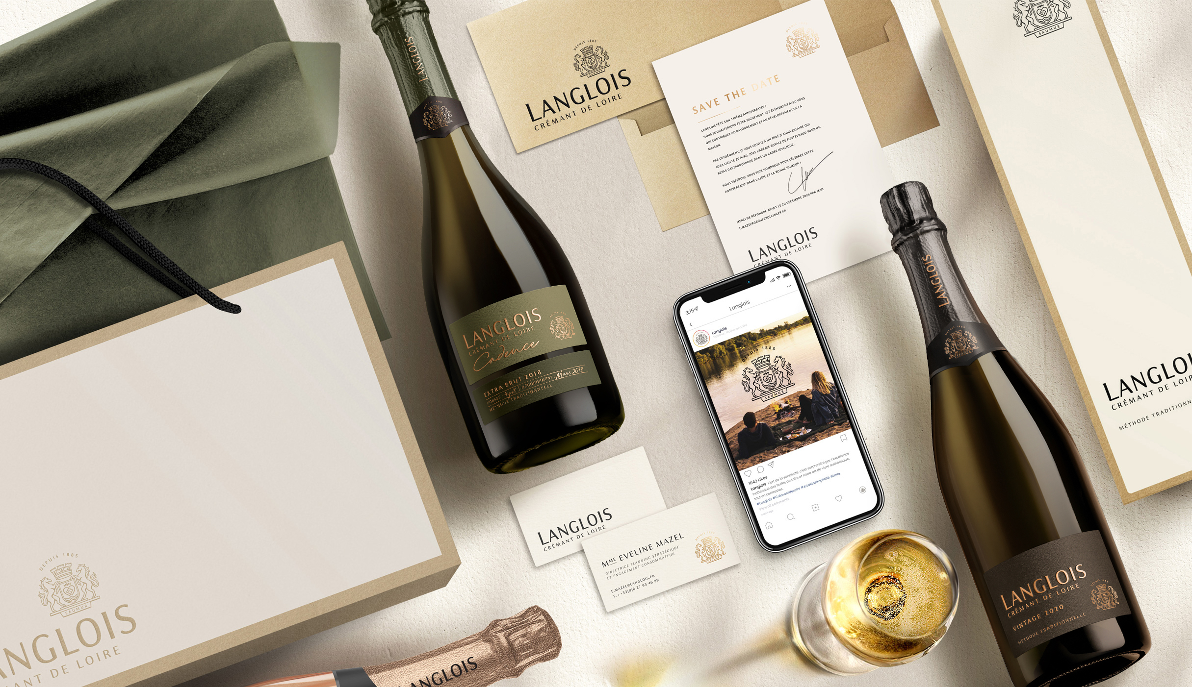
The brand's core identity comprises textures, materials, and natural tones of colours, contrasted with hot black foil to give impact and visibility. The coat of arms has been redrawn to improve clarity and modernity, contributing to the brand's overall aesthetic.
Brand Redesign
Maison Langlois, owned by the Bollinger group, was established in 1885 on the banks of the Loire River, where it produces exceptional Crémant de Loire with a commitment to innovation and uncompromising quality. Although the Crémant category is often viewed as a low-quality substitute for champagne due to its lower price point, Langlois utilises the Chenin Cépage to add personality, premiumness and distinctiveness to its Crémant de Loire, challenging this perception.
The brand aims to shift consumer perception away from comparing Crémant to champagne, positioning Langlois as a unique and desirable choice that elevates the category.
We capitalised on Langlois' key differentiators in the world of bubbles to establish the brand as a pure player with its own path and vision.
Langlois has always been able to harmoniously combine ancestral know-how with a precise and resolutely modern method. A unique mastery of the Chenin Cépage, in the service of an exceptional crémant.
Beyond its knowledge, the Loire region, and its famous river, is an inexhaustible source of creation. Its grandiose vast landscapes and unique colours are continually redesigned with each caprice of the river. Langlois draws inspiration from this beautiful and contrasting nature to offer an authentic, sincere and characterful Crémant.
The brand strategy and visual identity capitalise on these unique selling points to connect with consumers emotionally and challenge the establishment within the category. A 360-degree approach ensures the brand's positioning is accurately expressed across all touchpoints, from the brand strategy to the global visual identity, resonating with consumers at every step.
The bold branding choices reflect the Ligérien way of life with high spirits, simplicity, and light softness. The design prioritises simplicity, focusing on essentials while being spontaneous, less elitist, and technical. The natural and elegant aspects of the brand are allowed to express themselves through minimalistic touches and highly crafted details that enhance the product's quality look and feel.
The brand's core identity comprises textures, materials, and natural tones of colours, contrasted with hot black foil to give impact and visibility. The coat of arms has been redrawn to improve clarity and modernity, contributing to the brand's overall aesthetic.
Brand strategy
Positioning
Brand identity
Packaging
Key Visuals
POSM
Brandbook
Collateral
Close the full story